First, congratulations on taking the steps to start your own business! This takes a lot of courage and hard work, now here comes the fun part: figuring out what your visual identity should be. You know your market and your competitors, which is extremely beneficial in figuring out what your brand needs to look like. We are going to go through a few exercises to help you determine what your competitors are doing and what you can do to do better.
Let’s begin with a quick google search. Start by looking up your markets’ logos in your general area. For example: ‘Kitchen Remodeling Companies in Atlanta’. The first page of links will show you who is nearby, so by investigating their websites you can start to see what their logos look like and the color palettes they tend to use. Now copy and paste those logos into a document. After surveying your local competition, you will start to see which colors are being used the most. A lot of industries tend to use the same colors as people have already established subconscious ideas of what companies are about just based off-color.
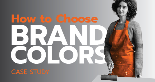
Case Study: If I told you to visualize a solid orange logo, what company would you think of? Best bet, it was most likely Home Depot. Other corporations within the same industry tend to use the same orange that has already established itself within the field. For example, Hitachi is one of the world’s largest manufacturers and sellers of big rig machinery for the excavation of land and power tools. When Hitachi bought Kawasaki, they underwent a huge rebranding. They saw that a mass majority of their new target audience was within the United States. In doing so they could see that people already had established trust with the color orange, which is primarily thanks to Home Depot. Hitachi left behind a forest green color for the beloved and trusted orange, making them now one of the most recognizable brands within construction worldwide.
Now we are not saying to copy exactly other brands, but it is good to know who your audience is, what they are looking for, and what your competitors are doing. After completing the first exercise, do another google search but try different locations. For example: ‘Kitchen Remodeling Companies in Nashville’, or ‘Kitchen Remodeling Companies in Miami’. This will help show you companies that are currently in business and are real.
Now in a new document, type into google images your market followed by ‘logo’. For example: ‘Kitchen Remodeling Logo’. You will quickly see that there is a substantial difference between the ones you researched and the ones shown on the page. A majority of these will be mock logos from websites such as Shutterstock, where you would be able to purchase the logo for your use. In a separate document save some from this page that you like.
Alright, here starts the fun parts. There are two options for the first step. Option one: export a jpeg of all the logos on one page from your initial research document. Take this jpeg and upload it to coolors.com or adobe.color.com in the palette generators to see what colors are most prominent. This is the cheat way to see what colors are used the most but to see complementary colors to those top colors as well. Option two: print it out and physically determine what colors are used the most.
By doing this you will be able to see what colors are being used in your industry, and what your target audience is already seeing.
Now you can start to ask yourself the following question: How is my brand going to stand out from the competition?
You see, knowing the colors of your competitors is a great thing, it makes it far easier to find contrasting colors to their brand, but also ones that fit the same theme. Are all your competitors using warm or cool tones?
For example, there are a lot of companies that follow the same color tones because they share the same target audience. Specific colors have already been given meaning due to marketing and advertising for the last hundred years. Therefore, customers already have a solid ground for familiarity with their products by color. However, color meaning has begun to change over time for instance: the color green used to be associated with rotten meat so green was never used in advertising meat products. Now green is associated with eco/organic products and now products are being advertised with a green color label. Color meaning does change over time due to cultural aspects and advertising. This is a very good reason to look into your industry and competitors to see what colors they are using for familiarity purposes. Also, to see what you can do to stand out from your competitors and why and how that will change your perception of your customer.
Case study: Growing up, most Americans remember the American Cookie Factory, it was a huge establishment in every mall with its glorious fresh cookie smell drifting everywhere. When imagining standing at the counter, first is the smell, second is the generous amount of frosting, and third was the colors. Their colors were primarily red, blue, and yellow with the chocolate chip cookie with white frosting. Now as modern times have come about the new trendy cookie is called Crumbl, their packaging is millennial pink with their logo on the box, mimicking high-end luxury packaging. Anyone who has that box will know they are holding cookies within the bright pink box. This is interesting because this pink color would not have been associated with food; however, Pantone’s color of the year in 2016 was ‘millennial pink’. Pantone sets out their colors of the year, but those colors don’t reach mainstream media design until roughly two years later. You will then begin to see their influence and how substantial those colors are as they begin to take shape within our marketing platforms. So, when you are picking out colors it is good to know what colors Pantone has declared are going to be the future trend. This does not always apply to all companies however it is good to know what is on-trend and why. This could be a major benefit in helping your company stand out from your competition. Now that you’ve seen what colors are being used within your competition and have seen the colors that are forecasted trends and why very successful brands are using those specific Pantone colors, it makes it much easier to choose what you need. Compare all the colors that each brand is using from your competition. Compare the colors of your competition that you would want to be like and compare other successful brands that you want to aspire to their level. Have fun picking out your colors, don’t pick colors that you are biased too, pick colors based on this analysis. Do not copy your competition, only take inspiration from them, and see what you can do to make it better. If you already had colors in mind for your branding, see how those colors would fit into your analysis and then make your judgment from there.